|
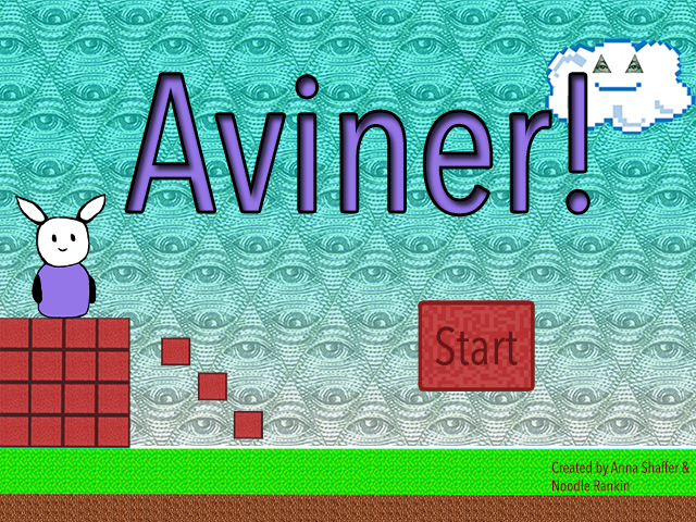
The process of making our game was hard. For most of it, I had no idea what to do. For a good part of it, we ended up copying Mrs.Jones' game that she'd made. And while we did get a lot done in the last couple of days, we spend most of the class time trying to fix little bugs that over all didn't really matter. However, I still enjoyed making the game. I wish we had made a starter game and then the actual one, just so we could get the hang of the software. I think my favourite part was testing out the game, even if something went wrong. If we end up doing this project again, I think I might try to get all of the elements in the game before going back and adding the final touches.
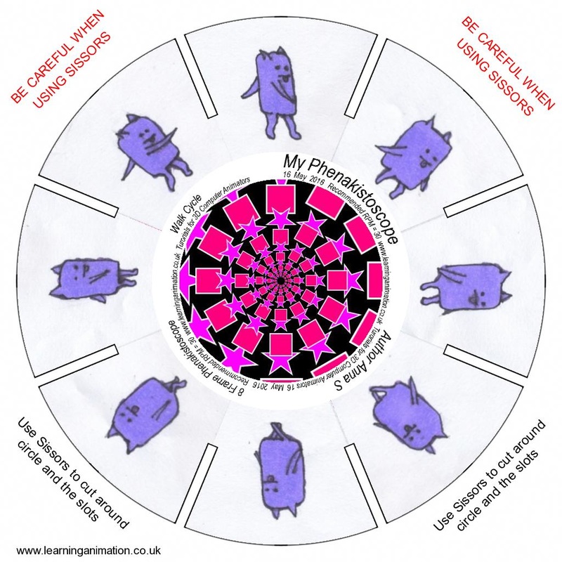
A phenakistoscope is an old way of animation where a bunch of different slides move really fast so that the object that was drawn appears to me moving fluently in a continuos loop (where a video starts over after it finishes until you stop it). Personally, I think I liked the flip book the best. I was a lot easier and in my opinion and you have more freedom to do what you want with it. I thought that making a phenakistoscope was really hard. It was hard to get the image centred in a way so that it would match up with the previous image, therefor creating a fluent animation,
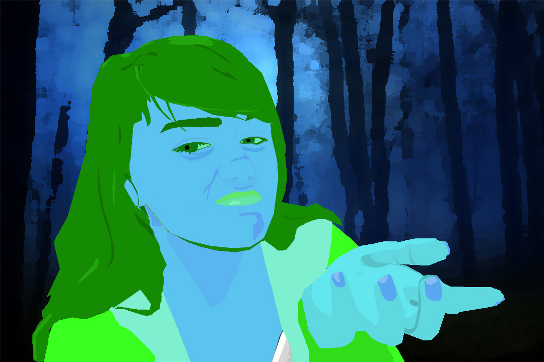
For this project, I chose to do the analogous colour theory with green, blue, and blue green. I think that it matches the picture because I look kind of cold in my picture and it kind of matches with the cool colours. I chose this background because I think that it matches the picture.I think that colour is probably the best one because I don't really like my artwork..
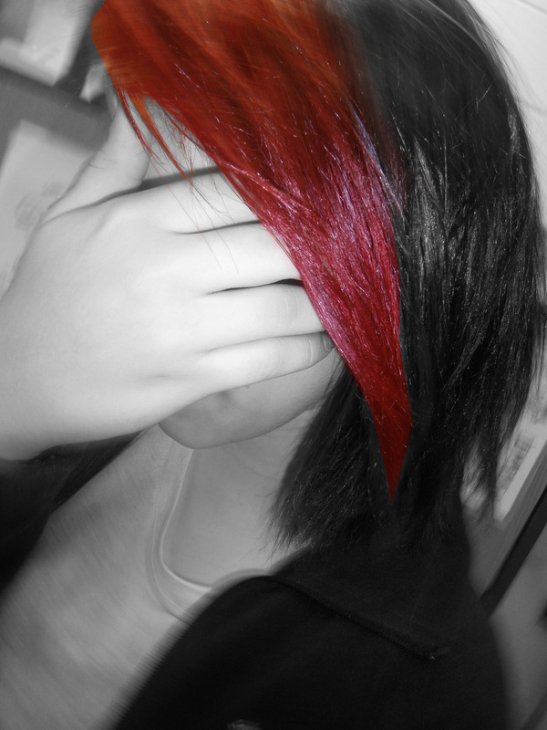
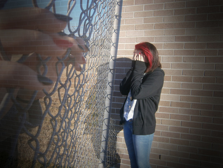
I choose these photos as favourites because I think that they represent the 'typical teen life' if you know what I mean. When taking the emphasis picture, Makayla had the idea to turn the camera at the same time of taking the picture. It turned out really cool! The second one seems like a picture that would be on tumblr or something talking about how hard it is growing up in modern society. I defiantly think that the colours in each photo help to set the mood of them. While I was looking forward to doing this project, I soon realized how much better everyone else was at this than I was.
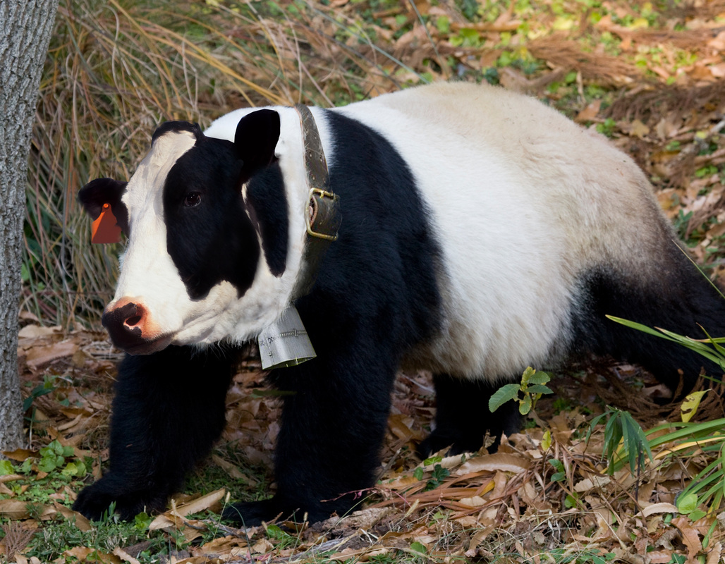
I'm actually really proud of this. I did a cow face on a panda body. I think that I did a really good job on texture and colour. During the blending process of blending the bell in with the body, I used the clone tool with the grass pen shape to make almost a mock fur look. I also used the clone tool to make the cow's black and white with the panda's black and white.
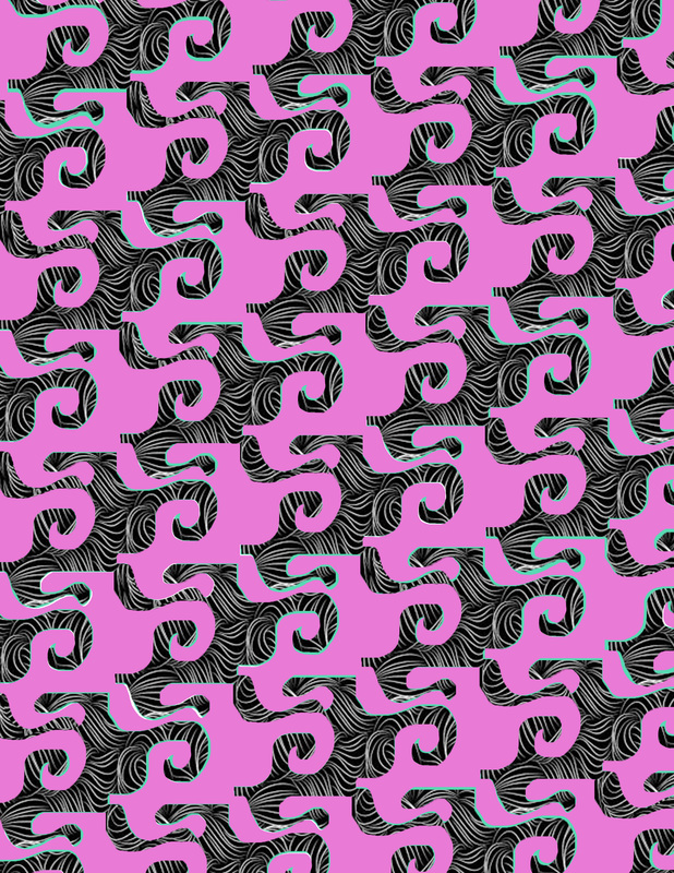
I think that colour and pattern were the strongest. I hated making the tessellation on the computer because I'm horrible with PS while doing it on paper was really easy. Mrs.Jones always talks about MC Echer and I think thats why she had us use a pattern in it because a lot of what MC Echer does is patterns.
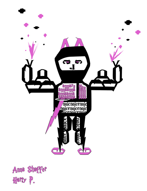
For my font bot, I used the Harry P font type. The Harry P font type is extremely serif. I think that in certain ways my fontbot matches the font but if you don't know what my fontbot is then you won't get it. I tried to make a ninja fontbot and I thought the lightning bolds seemed like a ninja sort of thing. I truthfully hated this project and the process of creating it. I have no creative thoughts going on in my mind whatsoever. Coming up with an idea for this might've been the hardest thing in the entire world. There was also a point when I realized how terrible it looked but it was to late to start over. My fontbots name is Kevin the Ninja after my hero Kevin the Sea Cucumber and Kevin the Ninja is on Naruto and he's awesome and he kills people.
Square 1 Art Project
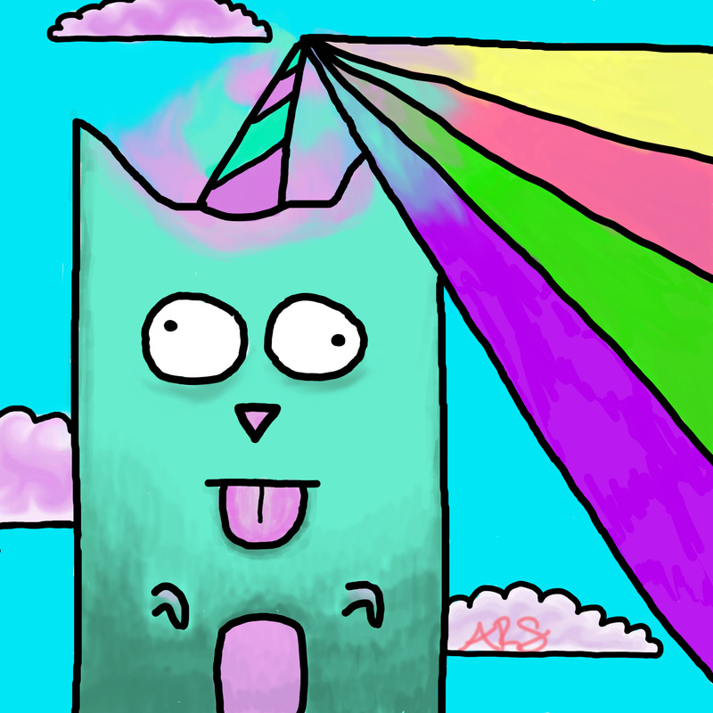
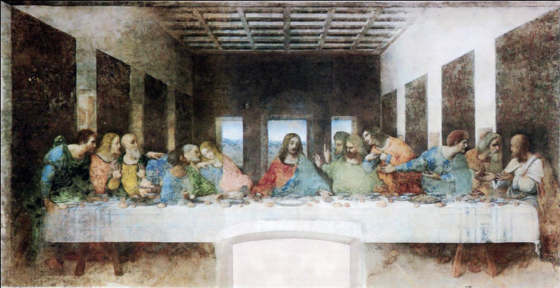
To create my unicorn alien cat, I started off with an initial sketch of it and then created my lines layer. After I finished my lines layer, I began to colour him in. I defiantly think that my strongest element was the colour. In my own opinion, I believe that the colours really go with each other for the 6 year old girl theme I was going for. My best principle was the balance. I tried no to have random open spaces and when I did, I covered them with clouds. I think there's enough empty space and covered space, but that's just my opinion. I know that a lot of people in the art class didn't like using the tablets but I think it just took some getting used to. Back in 4th grade or so, I remember using the tablets and hating them! I just think I didn't know how to use them back in that day. I'm just glad I didn't trust my 4th grade opinion. I really like this painting because it helps give a visual of the last supper; an event described in the bible. The detail in it as well is astounding and I've heard that its a fairly large painting.
|
